|
All 5 books, Edward Tufte paperback $180
All 5 clothbound books, autographed by ET $280
Visual Display of Quantitative Information
Envisioning Information
Visual Explanations
Beautiful Evidence
Seeing With Fresh Eyes
catalog + shopping cart
|
Edward Tufte e-books Immediate download to any computer: Visual and Statistical Thinking $5
The Cognitive Style of Powerpoint $5
Seeing Around + Feynman Diagrams $5
Data Analysis for Politics and Policy $9
catalog + shopping cart
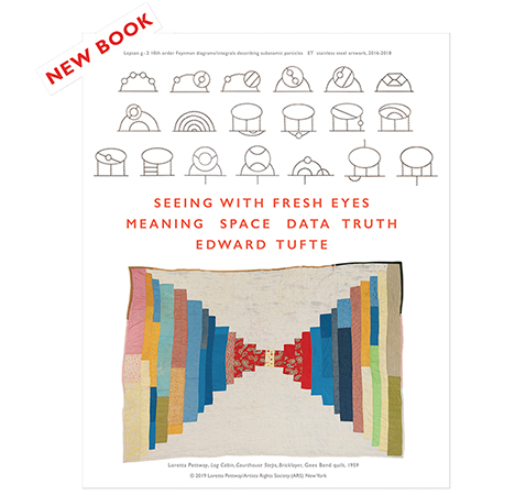
New ET Book
Seeing with Fresh Eyes:
catalog + shopping cart
Meaning, Space, Data, Truth |
Analyzing/Presenting Data/Information All 5 books + 4-hour ET online video course, keyed to the 5 books. |
For the book jacket of Beautiful Evidence, I used 4 photographs (Nikon N90, 105mm macro,
Velvia film at probably ISO100) of our dog Max
diving into a pond.
The photographs were taken around 1995 in about 10 minutes as our young athletic
Golden Retriever
was learning to dive and retrieve. The cover designed itself and was ready a couple of
years before I
finished the book itself. The book jacket mock-up (wrapped around an earlier book of
mine) provided
inspiration to get on with my work on Beautiful Evidence.
Then quietly the cover images turned into the logo for the book and maybe for logo-less
Graphics Press.
The Max Diving logo is recognizable at fairly small sizes. For example, in its appearance
(a happy luck-out)
on the iPhone screen:
 |
| (actual size) |
Or as a small ad at The New York Times website:
 |
| (actual size) |
Unlike the twisted typography of conventional logos, the image-as-logo gets better and better, revealing more detail,
as it gets larger and larger:
 |
The 4 images of the cover provide a gentle multiplicity of logotypes (ala the MTV and Google logos):
 |
| (about 43% actual size) |
The Max Diving logo has some properties of classic engraved postage stamps: readable at small sizes,
even more interesting at large sizes.
-- Edward Tufte
Response to Images as Logos: Max Diving
Nice! I can't think of anyone more deserving of a cameo during such an auspicious product launch. (I'm referring, of course, to your book, but Max is pretty deserving, too.)
I am particularly reminded of your mention (during one of your Dec 2005 seminars in San Francisco) of the inherent inefficiency of hierarchical voicemail systems. I'm so glad to see that someone was listening.
-Doug Neff
-- Doug Neff (email)
Steve Jobs, Jonathan Ive, and the Apple engineers are listening to--and even better-- acting on deep design principles: flat rather than hierarchical interfaces, high resolution (the iPhone has a 160 dpi screen), integration of text and image, and celebration of user needs rather than celebration of software house needs. And then there is a superb sense of style: elegant, cosy, straightforward. The excellent taste also shows up in choosing what technologies to combine. All this is reflected in a long series of products that have solved complex interface and industrial design problems better than anyone: Macintosh, NeXT, OS X, the Cinema monitors, iPod, iPhone. (Aperture would also make this list if it didn't crash so much.)
I've never consulted for Apple or had much contact with them, other than ordering their products. Probably 50 people from Apple have taken my one-day course over the years. Jef Raskin and I had some interesting conversations (we agreed on nearly everything except on his high valuation of user testing) and, years ago, Alan Kay told me that the best book on interface design was, of all things, my "The Visual Display of Quantitative Information." I had imagined that the book was about statistical graphics but was delighted to hear that the ideas might have some generality, something that he saw long before I did.
-- Edward Tufte
Response to Images as Logos: Max Diving
The Max Diving image is particularly eye-catching on the iPhone screen. The colors are brilliant without being overpowering and the viewer's gaze is drawn to this image. Don't all good logos work like this?
-- Miklos Kiss (email)
Response to Images as Logos: Max Diving
There may be a temporal component to your photograph also.
As I scroll upwards from the last text response on my Acer laptop (which has a handy dedicated scroll button below the touchpad), the large single photo of Max diving is revealed incrementally in my browser window, as a vertical wipe would reveal an image in video production.
The effect I'm seeing is one of lateral movement of Max from right to left and, a separation of Max's orange fur from the blurred green background, creating an illusion of depth in a motion image.
I think this must be an interaction of your image's heavily blurred background with the pixel resolution of my LCD display as the pixels are updated during the scrolling action.
This doesn't work when scrolling the browser window manually, which produces a smooth scrolling effect in small pixel increments, but only with the software control of the action created from this button press. It is scrolling the screen in vertical increments of about four lines of text.
My brain is filling in the gaps, creating the illusion of lateral movement and depth in the image, as it scrolls by in staccato increments.
-- Kenn Mayfield (email)
Saul Steinberg drawings
Sparkling work at
http://www.smithsonianmagazine.com/issues/2007/may/object-steinberg.php
-- Edward Tufte
Response to Images as Logos
Here's a New York Public Library production from their Digital Library: Scrapbook of Russian bookjackets, 1917-1942.
-- Edward Tufte
Response to Images as Logos
My jacket for Beautiful Evidence came in first in the Print annual New England design awards:
 |
MIT and Yale University books/ephemera won 7 of the 45 runner-up awards.
-- Edward Tufte
Dear ET,
here is a very nice use of postage stamps as small multiples forming part of an invitation to a talk on Postage Stamps by Type Designers: A Primer. Held at The Typophiles on Wednesday, September 23, 2009 at the National Arts Club. The talk was by Michael Russem the principal of the Kat Ran Press of Cambridge, Massachusetts - http://www.katranpress.com/news.html.
Best wishes
Matt

-- Matt R (email)
|
||||||||